Tracking Round Selection (Map Wizard)
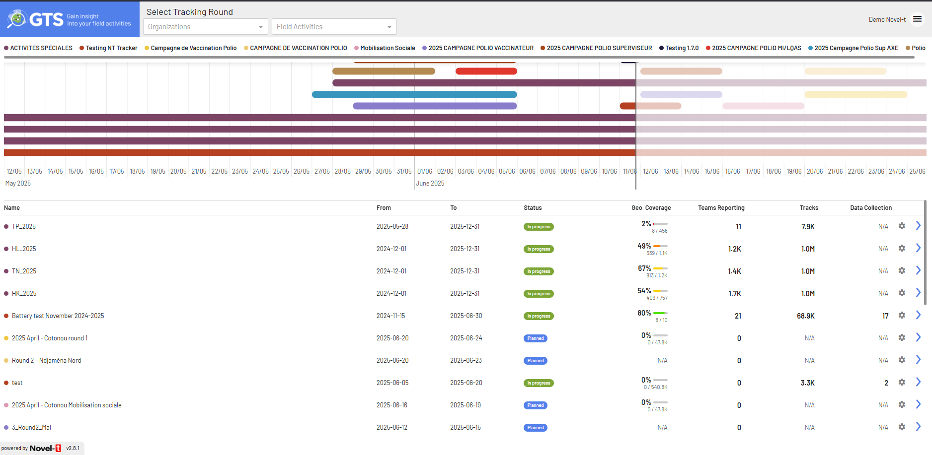
The Tracking Round Selection screen – branded the Map Wizard – lets authorised users explore and analyse campaign data through an interactive timeline and statistics table before opening the map view. The 2025 redesign introduces hierarchical navigation, streamlined selectors, contextual pop-overs and additional key performance indicators (KPIs).
Overview
At a glance, the page is laid out in three horizontal zones:
Header bar – logo, selectors, global search & view toggles.
Timeline – collapsible Gantt view of all selected Tracking Rounds.
Statistics table – sortable list of rounds with detailed KPIs.

Full Map Wizard dashboard
Header bar
Organisation selector – single-select dropdown. Choosing an organisation refreshes the Activity selector and the timeline.
Activity selector – single-select dropdown (All Activities by default). Limits the rounds displayed below.
Search box – free-text search across rounds (name, codes, dates). Useful when dozens of activities exist.
View mode buttons – toggle between narrow list / comfortable list / compact grid (icons at right of search box).
User menu – profile & sign-out.
Timeline (Gantt view)
Field Activities are grouped by Organisation (expand ▾ / collapse ▸). Each grey bar represents a Tracking Round; its length equals the start & end dates. A Today vertical line helps spot delays.

Hierarchical timeline with pop-over (mock-up)
### Hover pop-over
Placing the cursor on a bar reveals a pop-over with:
Tracking Round name + status & dates.
Organisation / Activity names (context breadcrumbs).
Mini-bars for Geographic coverage and Team reporting.
⚙ Configuration (admins & FA focal points only).
View on the map > (opens map filtered to this round).
Statistics table
The lower half displays one row per Tracking Round, mirroring the timeline order. Columns:
Column |
Description |
|---|---|
Name |
Two-line label: Organisation – Activity (small) + Round name. |
From / To |
Planned start & end dates. |
Geographic coverage |
% reached (mini-bar + numeric). |
Team reporting |
% active teams (mini-bar + numeric). |
Unique Teams |
Count of distinct team IDs uploading tracks. |
Duration |
Effective tracked time (hh:mm or days). |
Status |
Planned | In progress | Completed. |
Actions |
⚙ (configuration) · View on the map > button. |
Rows are striped; hovering highlights the current row for clarity.
Walk-through
Pick an organisation Select Organisation #1 to load its activities.
Filter by activity Choose Activity #1 or keep All Activities.
Locate your round Use the timeline or type a keyword in Search.
Inspect coverage Hover a bar to check geographic / team KPIs.
Open the round Press View on the map > (popover or table) to launch map view.
Adjust settings Click ⚙ (if visible) to edit metadata, targets or exports.
Key differences vs v2.8 implementation
Selectors – replaced multi-select chips with single-select Organisation and Activity dropdowns.
Hierarchical timeline – groups by Organisation → Activity, replacing the flat coloured-legend view.
Colour scheme – bars adopt a neutral grey; KPIs use small accent bars inside pop-over & table.
Popover details – contextual overlay consolidates stats & actions.
New KPIs – Unique Teams and Duration columns added; Tracks and Data collection removed.
Action buttons – added explicit View on the map > button per row; gear remains for privileged users only.
Global search & view toggles – quick filtering and density control in header.
Troubleshooting
No data after selecting an organisation? Confirm the Field Activity is active for the chosen year.
Configuration gear hidden? Your role lacks Admin or FA focal point permissions.